Remote Sensing Using Multispectral Analysis
November 01, 2014
November 01, 2014
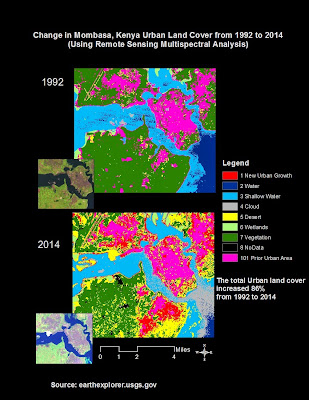
GIS software can identify urban and non-urban land cover, and combine the two images and measure the growth in urban land cover. Over 12 years the city grew by 86% in land over. According to the Kenya census, the population also doubled from about 460,000 people to a million during that same period.
How does Remote Sensing and Multispectral Mapping actually work? Below is a 3 min video from a guy in a turtleneck explaining it:
GIS software has the ability to identify different patterns of images on maps, and pick our urban land, vegetation, water and other uses. The tools in Arcmap can conduct both supervised and unsupervised classifications. When unsupervised, the tool will basically go through and classify all of the various patterns it finds on its own. Since computers aren't as smart as people on their own as picking out patterns, this can lead to a lot of patterns output and the results might not be very enlightening.
However under a supervised classification you can train GIS by selecting samples of an area that represent the pattern for each type of land cover. So you can select urban and vegetation, water, or desert for example. Now when you run the tool the software will try to match each area to the closest example that you used to train the model (In my example below this is what I did.) The power of this tool is pretty extraordinary if you combine it with machine learning, or other data such as the specific light frequencies available from USGS Landsat data.
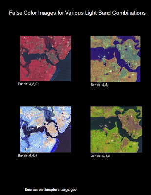
USGS satellites have the ability to separate images into various light bands. This is an incredibly useful tool for making patterns of certain features much more pronounced and easy to train a model to identify. Using both visible light, as well as infrared and heat imagery, you can combine different combinations to more clearly identify differentiate objects. Combining two different bands can filter out the shaded side of a hill, and leave a unique signature of the rocks and plants in the area. A false color image can create stark a contrast that delineates urban and non-urban areas. It should be noted that using light frequencies allow for you to filter out shadows and other features and define features clearly.
Each pixel has a value and when you assign a false color (Red, Green, or Blue), that value is represented as a shade of that color. However those number values are real frequencies in the light spectrum across the band selected. If you knew the exact frequency of light reflected from a particular plant, you could use this process to highlight those specifically from everything else including other types of plants in the image.
However under a supervised classification you can train GIS by selecting samples of an area that represent the pattern for each type of land cover. So you can select urban and vegetation, water, or desert for example. Now when you run the tool the software will try to match each area to the closest example that you used to train the model (In my example below this is what I did.) The power of this tool is pretty extraordinary if you combine it with machine learning, or other data such as the specific light frequencies available from USGS Landsat data.
USGS satellites have the ability to separate images into various light bands. This is an incredibly useful tool for making patterns of certain features much more pronounced and easy to train a model to identify. Using both visible light, as well as infrared and heat imagery, you can combine different combinations to more clearly identify differentiate objects. Combining two different bands can filter out the shaded side of a hill, and leave a unique signature of the rocks and plants in the area. A false color image can create stark a contrast that delineates urban and non-urban areas. It should be noted that using light frequencies allow for you to filter out shadows and other features and define features clearly.
Each pixel has a value and when you assign a false color (Red, Green, or Blue), that value is represented as a shade of that color. However those number values are real frequencies in the light spectrum across the band selected. If you knew the exact frequency of light reflected from a particular plant, you could use this process to highlight those specifically from everything else including other types of plants in the image.
Below are several false color images of a few combinations that can be created using different bands. Notice how in the first, urban land is green and different geological features are shades of red. The image in the bottom left of the graphic shows different ocean depths and the reef clearly. Each combination of light bands highlights different types of features.
The next images shown are the analysis for the two different time periods. The small images show the satellite image of the bands used (5,4,3) and the large images show the classification of land cover that was completed using image analysis tools in GIS. The area identified in red for 2014 denotes the new urban land cover that grew over that period while the pink areas illustrate the original urban area.
Each pixel represents a square area 30m by 30m. The total growth in area therefore can be computed by simply counting the total red (New Urban Growth) and pink (Original Urban Cover) pixels.
Here is a list of all the different band combinations and uses for each.